Washington Communities for Children
| For about a decade, 10 Early Learning Regional Coalitions have existed across Washington State, but have all operated independently. These 10 Regions have recently decided to come together and begin intentionally working together as the new entity: Washington Communities for Children. Washington Communities for Children's mission is to connect local and statewide efforts to improve the well-being of children, families, and communities. The organization reached out to me to help them with a logo can communicate the following message:
What wasn't allowed:
Fair enough. Out of four different concepts the group selected the one to the right. A graphic that resembles an apple (Washington) but also features "connectedness" with two "people" holding hands. The color palette was chosen by the organization. Thank you Washington Communities for Children for the opportunity. The logo is the first effort in branding and once the website is created I will link it here if you'd like to learn more about this wonderful effort. UPDATE: Here is the website https://www.washingtoncfc.org/ | 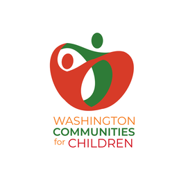 |
The Rustic Tap House
| A friend approaches me about one of his colleagues who is opening up a bar & grill in Colorado. As with every logo or art project, it's always best to initiate a conversation to understand your client's vision. Although I didn't talk to the owner of the bar & grill directly, this was the description given to me: "It's a brewery/craft drink bar, with live entertainment, and fresh farm to table offerings. The establishment will be a very simple ambiance. I think of Twin Peaks with the Rustic feel, mountains, butcher block tables, and a straightforward, simple setting." I can work from that! I submitted a few concepts and the one shown here was the winner. I had a great time interpreting the description given to me and I'm very happy to be able to deliver the client's vision, keep it simple. | 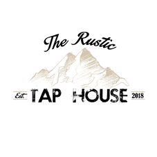 |
The BOP Collective
| The BOP collective is a group of Pacific Northwest growers that are based on the idea of community. The collective is a diverse group of connoisseurs striving build positive and thriving community through cannabis. They needed a "grown up" logo to symbolize their growth as a collective and was looking for something less cartoony and more "professional". The final product you see here, a typography logo with a silhouette of a marijuana leaf in the "O" communicates who they are and what they do. Check them out at their Instagram @Bopcollective420 and at their website bopcollective420.com Huge thank you to the BOP Collective for this opportunity! | 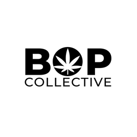 |
N'AYR Collections
| N'AYR (pronounced "en-ayer") is a new venture from Ryan Grovey who is the Global Trainer/Director of Leadership Development at MIXXEDFIT. With a loyal following and a worldwide network, Ryan's brand power has grown to where he is ready to give in to the demand. N'AYR is a lifestyle brand focusing on comfortable and stylish active wear. As with all new ventures, a logo is required to lead the branding effort. The "N" you see here is outlined with bold lines using negative space to exhibit the "N". The pieces his in collection is bold, built with comfort, stylish, and made for everyday day living. | 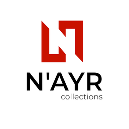 |